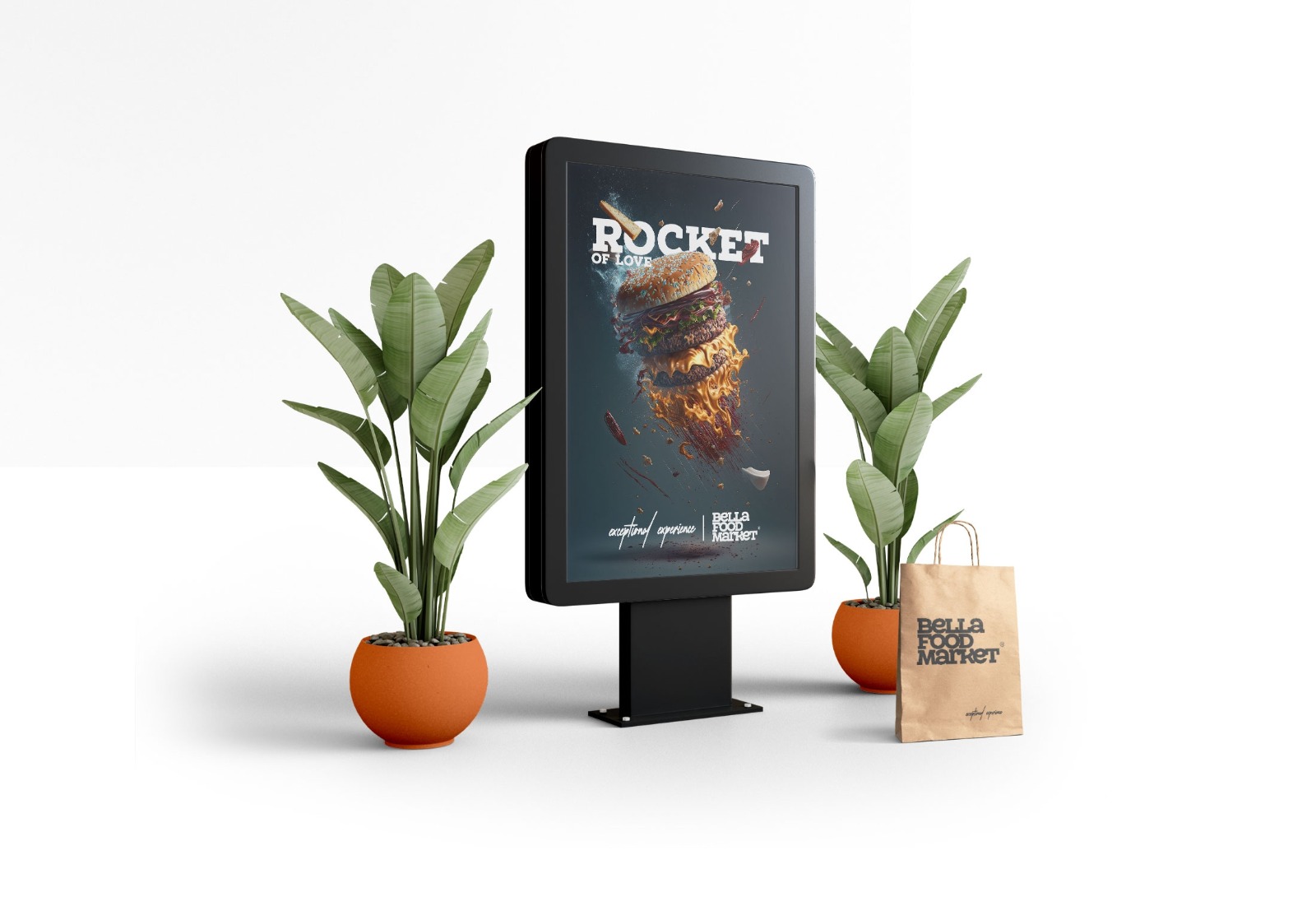
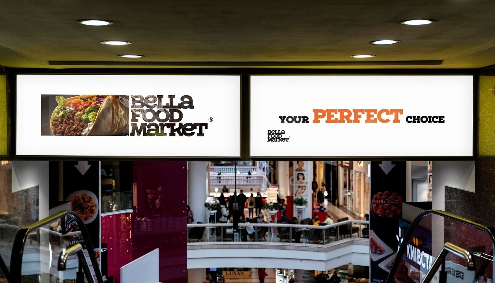
BellaFoodMarket’s visual branding was designed with a strong focus on creating a bold, dynamic, and memorable identity. The color palette, featuring black and orange, was carefully selected based on color psychology studies. Black symbolizes sophistication, elegance, and reliability, while orange evokes energy, warmth, and excitement, making it perfect for a food market aiming to appeal to a wide audience. This striking combination reinforces the brand’s modern, confident image while creating a visually impactful experience that stands out and resonates with consumers.